Other work — Booking.com
Trial & purchase flows
Redesigning the App Store trial and purchase experience to cut churn without touching conversion.
- Product designer
- Interaction design · Visual design · Experience design · Information architecture · Research & testing
- Booking.com App Store team, one designer, a copywriter, a product owner and our director.
Impact
- Churn ↓after the trial period
- Flatconversion at purchase, held as a guardrail
- 2 stepsone commitment per screen, terms then consent
- Trial flow,
- Purchase flow,
- Consent & scopes,
- Reminder policy,
- Mobile parity
Partners were billed for software they had never decided to keep
Partners started App Store trials without ever reading the commercial terms. Price, trial length, billing date and cancellation were scattered across dense screens and small print, and the third-party data an app would receive was never shown in full before consent. The consequence landed after the trial: partners were billed for software they had not decided to keep, and churn at that moment was the team's pressure point. Conversion at the point of purchase, however, was a number nobody was willing to trade.
Cut post-trial churn, and treat purchase conversion as a guardrail
Reduce churn after the trial period without compromising the conversion rate at purchase — treating conversion as a guardrail metric rather than a target.
Rebuild the surface first, then the logic underneath it
I rebuilt the flow in two passes: first the surface, then the underlying logic. Each pass had to leave conversion untouched.
Phase 1 — Foundation setting
I revamped the visual aesthetics and refined the content hierarchy of the trial and purchase flows, so the commercial terms (price, trial length, billing date, cancellation) read clearly before a partner commits. Conversion was measured throughout: the new design had to hold it flat while laying the groundwork for the phase that followed.
Phase 2 — Churn reduction and flow optimisation
Working closely with the App Store team, I redesigned the underlying logic, the user flow and the content. The decision was split so that a partner made one commitment at a time, and everything that would happen later (the billing date, the reminders, the data an app could reach) was made explicit at the point of consent.
- Two-step flow: confirm the trial terms, then connect the provider, one decision per screen.
- Explicit reminder policy (7 days and 3 days before billing) surfaced inside the agreement, not in the small print.
- Permission scopes for the third-party app shown in full before consent, with separate acceptance for Booking.com and partner terms.
- Mobile parity: the same logic and hierarchy carried into the partner app.
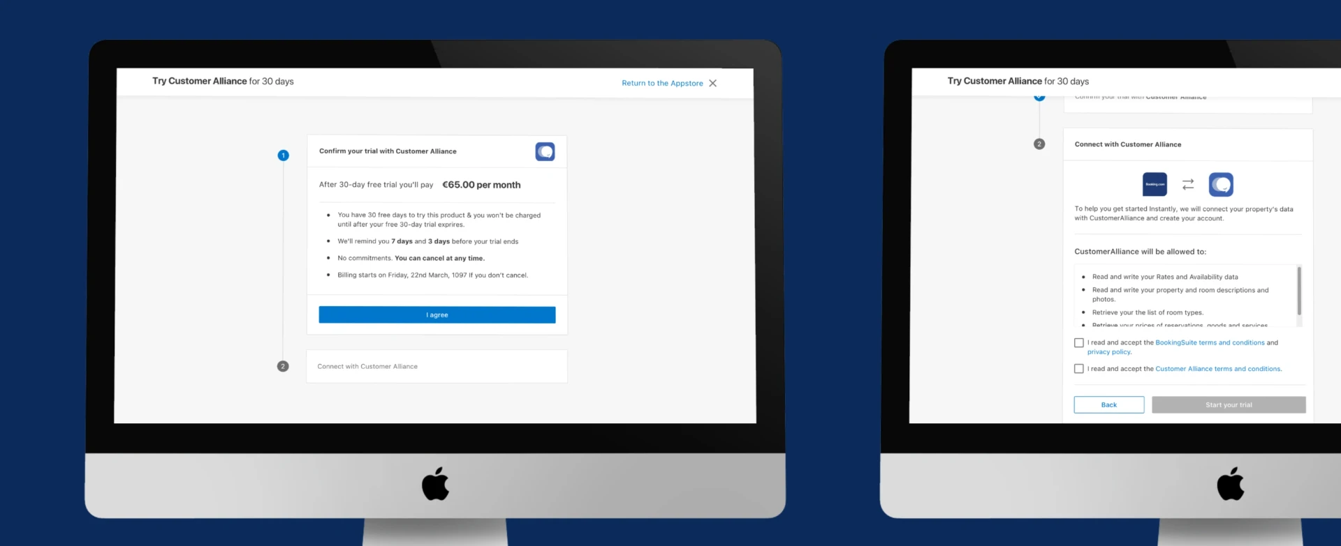
Desktop — step 1 confirms trial terms and billing date; step 2 shows the exact data scopes before consent.
Carrying it to mobile
The partner app could not become a lighter, vaguer version of the same commitment. The two-step logic, the consent scopes and the connection state were carried across intact, so a trial started on a phone told the partner exactly what a trial started on desktop did.
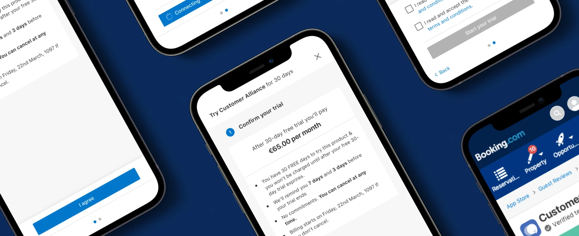
Mobile — the same two-step logic, with connection state and consent carried into the partner app.
Churn fell and conversion held
- Churn after the trial period fell, with no loss in conversion at the point of purchase.
- Commercial terms, price, billing date, cancellation, became legible before commitment rather than after it.
- Partners saw the exact data scopes an app would receive before granting consent.
- The same flow logic shipped on desktop and in the partner app.
What I'm looking for
Product design, design systems, AI-native product.
- Senior / lead product design, design systems, AI product
- Amsterdam, Netherlands. Available in the EU and remote.
- Open to conversations now