Online Check-in
Turning the worst part of arrival into something guests finish before they land.
- Lead product designer, end-to-end
- Multi-year, pilot to funded global rollout
- PM, PMM, data science, research, engineering, external OCI partners
- Guest check-in, partner portal, 80-market legal audit
Impact
- 71%Conversion in the best performing flow
- -25%Passport-step drop-off, after the redesign
- 35Countries of check-in law audited
Context
Arrival is the first thing a guest experiences and the last thing anyone designs. Queues at the desk waste the first hour of a trip, and on the supply side they force properties into 24/7 front-desk staffing, a fixed cost small accommodations can't carry. Booking.com wanted guests to complete check-in before they arrived: better for travellers, structurally cheaper for partners, and a capability no other booking platform offered end-to-end.
I led design from the single-property pilot through to the funded global rollout, working across product, research, data science, engineering, property partners and the external check-in providers whose systems we had to interoperate with.
The problem
I led the user research, primarily interviews, to locate where the pain actually sat. For guests, waiting at a desk after a long flight or during a peak arrival window was the single most cited frustration, worst for families and late-night arrivals. For properties, check-in was resource-intensive: staff the desk around the clock, or coordinate manual key handovers with guests who cannot tell you when they will show up.
Both sides were paying for the same missing capability: a way to complete the administrative part of arrival before arrival.
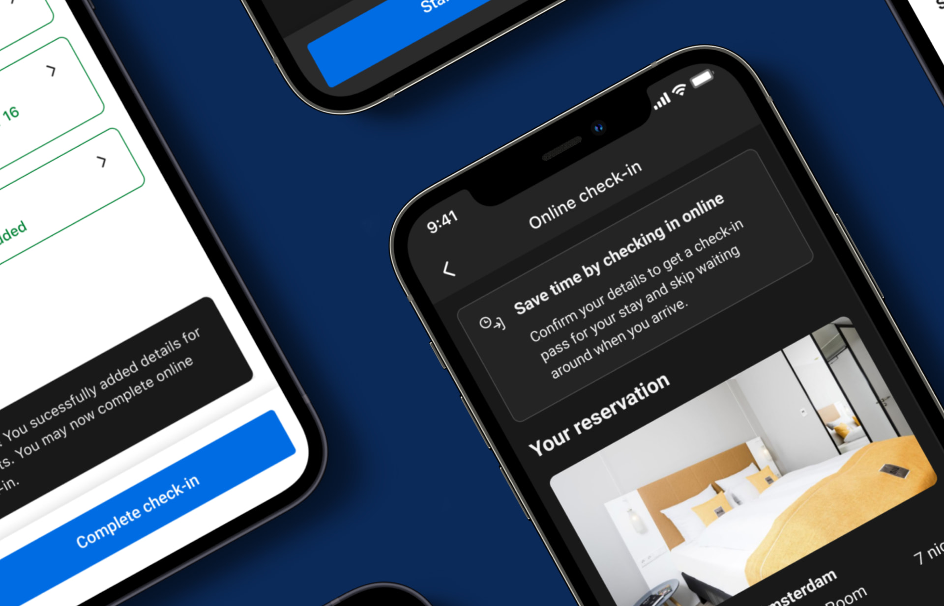
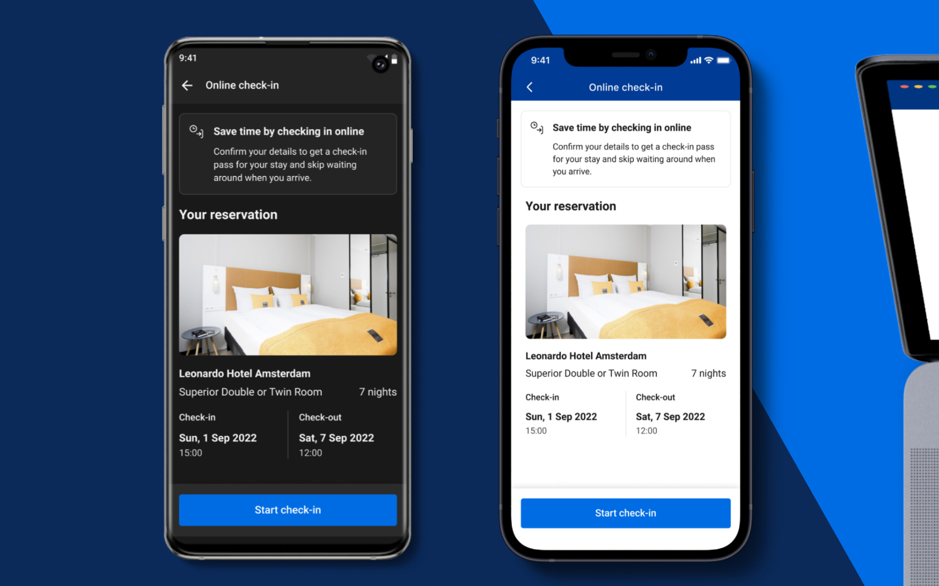
The arrival moment, reduced to one decision: prompt, reservation, a single clear action.
Research, and who we designed for
Discovery ran across four methods with our supporting researcher: in-depth interviews with guests and property managers; remote usability testing on a working prototype to watch where people stalled; contextual inquiry inside hotels and at our software partners, observing the workarounds already in use; and joint analysis sessions that turned findings into decisions in the room where design happened, and a report afterwards.
Past-usage data and interviews gave us three guest segments with genuinely different motivations, and two property archetypes with different economics.
- Solo business travellers
- Time-sensitive. Wanted to check in while in transit and walk straight to the room.
- Couples
- Optimising for destination time, not admin time. Any delay at arrival was time lost from the trip.
- Families and groups
- Hurt most. More people means more forms, usually after a long flight with tired children.
- Large hotels
- Needed relief from 24/7 front-desk staffing, especially outside peak hours.
- Small and apartment-style properties
- No desk at all. Manual key handovers meant a host waiting around for an unknown arrival time.
How we defined success
Before design started I agreed measurable success with our PM, PMM and data scientist, so every later decision had a scoreboard rather than an opinion.
- Conversion rate
- At least 20% of eligible guests completing online check-in.
- Operational efficiency
- A measurable reduction in the staffing needed to handle arrivals, particularly outside peak hours.
- 5%
- 20%
- 71%
The best-performing flow finished at 71% of eligible guests.
45
Cut what the law doesn't require
Before touching a single field I went after the obligation behind it. I initiated and led an audit of check-in regulation across 45 countries, working with legal and with local market teams, and used it to remove every field that was not legally required in that market. In most regions this stripped the form down materially.
Structure was then decided by evidence rather than convention: usability testing showed a single-page form converted best on desktop, while a grouped multi-step form with progress indicators won on mobile. The team shipped both from the same content model.
Inherited form
- One global field set, sized to the strictest market
- Fields kept because a property once asked for them
- Same questions whatever the guest's destination
Law-audited form
- Field set resolved per market from the 45-country audit
- Anything without a legal basis removed outright
- One content model, rendered as a desktop page or mobile steps
Fewer questions, decided by law
The largest single friction reduction in the product came from regulation research, not interface work.
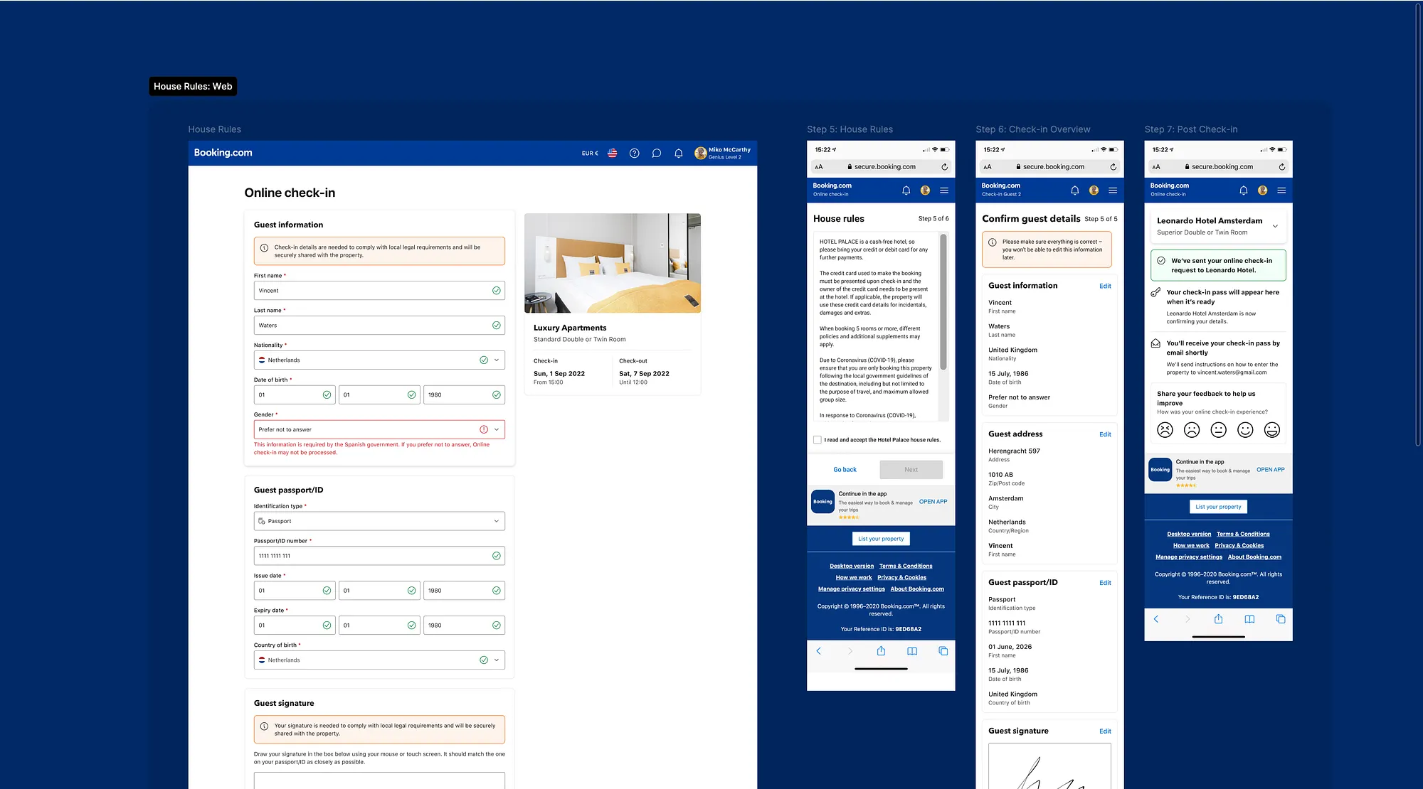
Same content model, two structures: one desktop page against grouped mobile steps, including house rules where properties require acceptance before key exchange.
-25%
The trust problem: passport data
What the law did require still leaked. The biggest single drop in the funnel was the passport step: guests stopped when asked for identity documents without being told why. It read as data collection, not compliance.
I designed the fix as explanation rather than visual polish: plain-language messaging stating that the information is required by local law and shared securely with the property, a help tooltip that answered the follow-up question in place, and security signalling positioned exactly where sensitive data is entered. I specified it as an A/B test with our data scientist, a base variant with minimal explanation against the redesigned one.
Base variant
- Document fields requested with no stated reason
- Help copy lived on a separate page, off the flow
- No security signal at the point of entry
Redesigned variant
- Plain-language legal requirement stated in place
- Tooltip answers the follow-up without leaving the step
- Secure-handling badge next to the sensitive fields
-25% drop-off
A/B tested with data science across the live check-in funnel; the winning variant changed explanation, not layout.
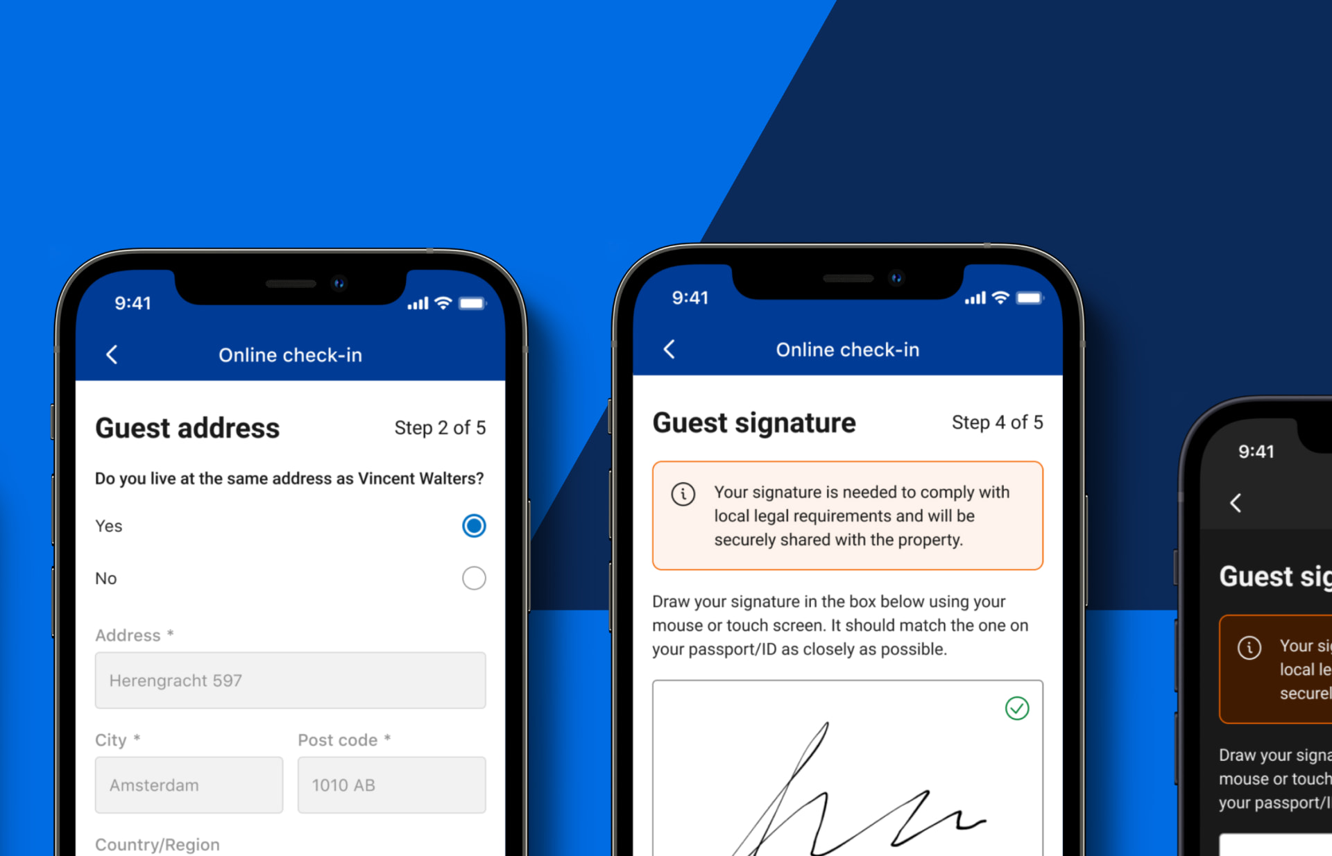
Legal-requirement messaging placed at the exact points guests hesitated, the change that moved the number.
Multi-guest, made native
Group bookings originally forced guests through a separate check-in flow for each person, the exact segment already under the most pressure. I added native multi-guest support so one person can complete the whole reservation, then merged the multi-guest landing page with the edit-guests page, removing a screen from the path entirely.
Both changes cut drop-off measurably on the pages they touched.
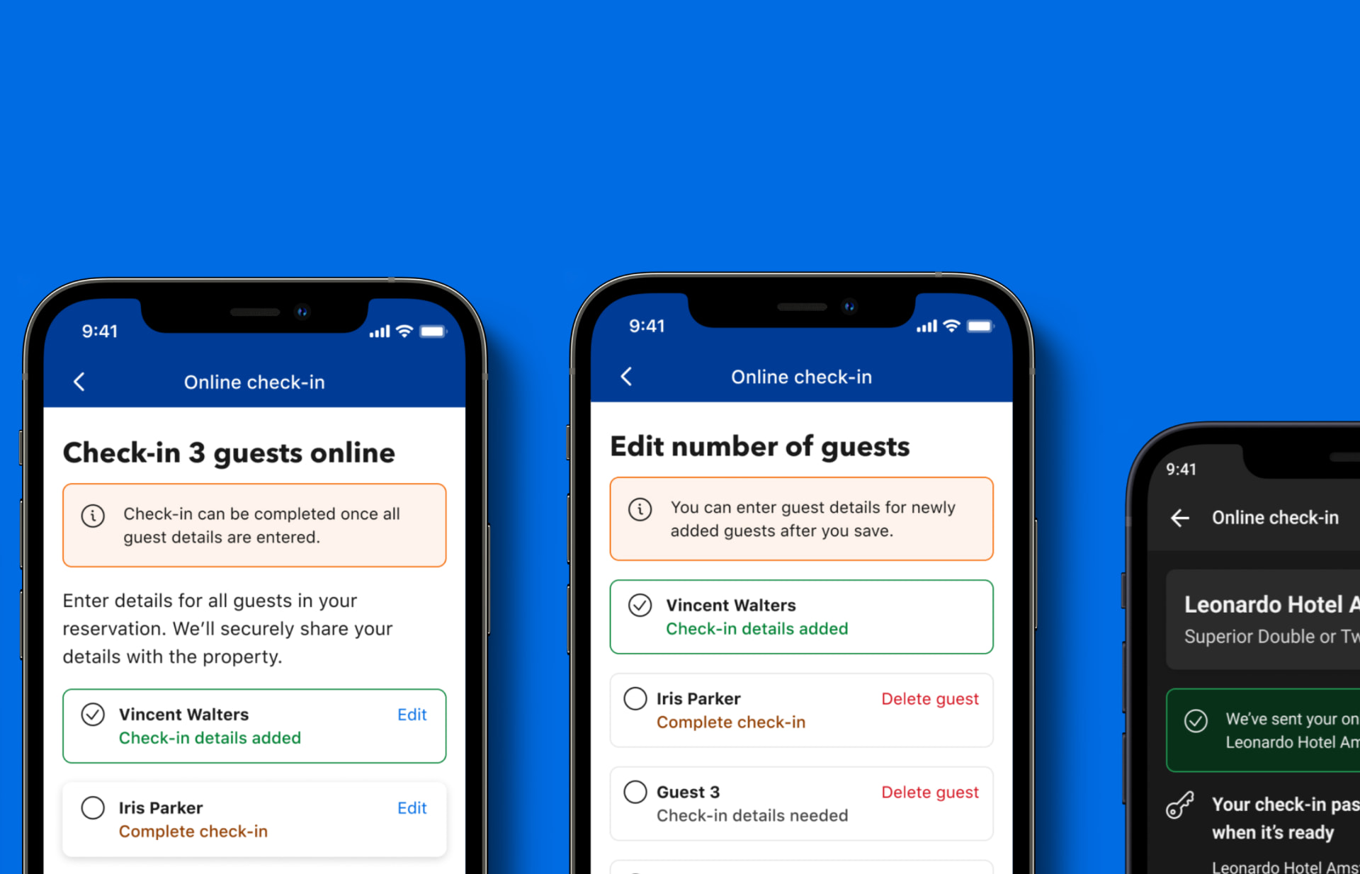
One person, one flow: every guest carries their own status in a single view.
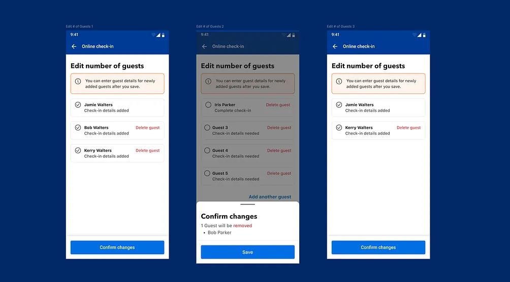
The merged edit-guests page, a removed screen, with destructive changes confirmed before saving.
How the decisions got made
For each problem I organised and facilitated cross-functional workshops: mind mapping to explore how we could communicate privacy and security, affinity diagrams to turn usability findings into a ranked list of what to fix first. Ideation started with me walking the team through the problem and the research, then wireframing the journey together.
Interaction design targeted cognitive load specifically, pre-filled details for returning travellers, which required a non-trivial integration with Booking.com's Identity Management team; one unambiguous primary action per step; progress indicators so guests always knew how much was left. Before build, I ran an implementation workshop with engineering and adjusted the design for the constraints that surfaced there.
Confirming and completing
The last steps carry the compliance weight: signature, house-rules acceptance where the property requires it, a full review of everything entered, and a confirmation stating exactly what happens next and when the pass will arrive. We added a feedback prompt at the end, which became a continuous source of qualitative signal after launch.
A complete arrival system
After two years of iteration the product was no longer a form. Guests received a digital check-in pass tailored to the property's requirements; smart-lock properties issued digital keys for contactless room access; everywhere else, guests got explicit instructions on where and how to collect a physical key. Post-check-in actions (late checkout, directions, online check-out and key drop) closed the loop at the other end of the stay.
That flexibility let us serve both large hotel chains and single-apartment hosts.
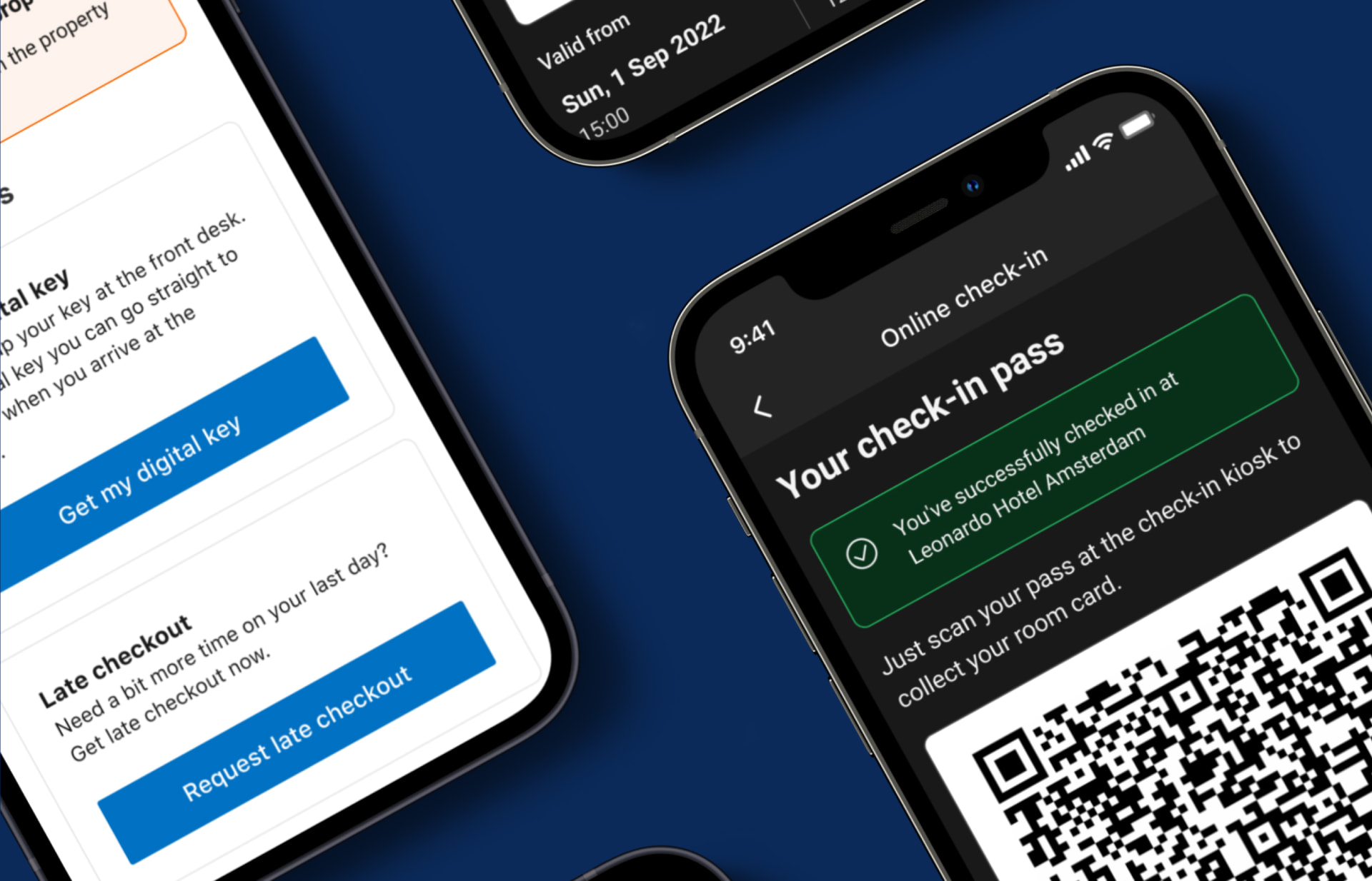
The pass adapts to the property: QR code, digital key, or instructions for a physical one.
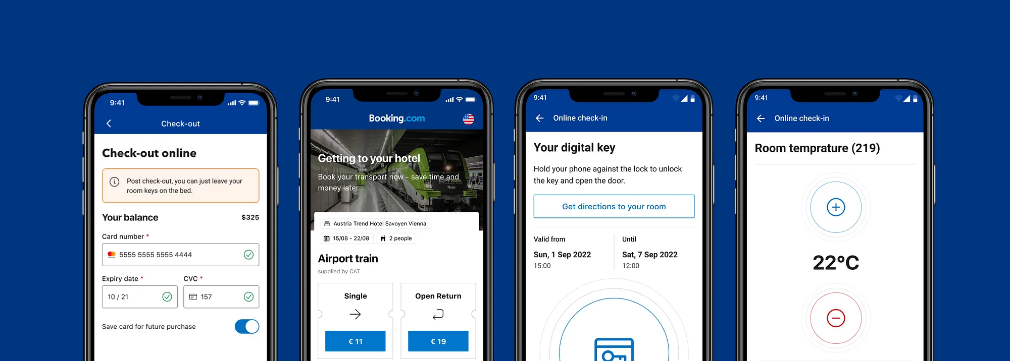
The same surface at the other end of the stay, balance, onward transport, in-room controls, check-out.
71%
Validation after release
Every release was wrapped in an A/B experiment against a stated hypothesis. Session replays and heatmaps showed where guests hovered, hesitated and abandoned, particularly around sensitive data, and the post-check-in feedback prompt gave us the qualitative half of the picture.
The best-performing flow converted at 71% against a 20% target. Across all flows, property types and regions the average exceeded 23%, the highest in the industry, which we could verify because most competing check-in providers were also Booking.com partners.
- 20%
- 23%+
- 71%
Two honest numbers rather than one: the aggregate average missed the target, the best flow more than doubled it.
Results
Outcomes
- Best-performing flow converted at 71% against a 20% target; the all-flow average exceeded 23% and was, by partner-data comparison, the strongest in the industry
- Detailed messaging and secure badges cut drop-off at the passport step by 25%
- Partners reported lower front-desk staffing for check-in needs, freeing the front-desk to focus other tasks
- Leadership approved and funded global rollout after the pilot
Reflection
Learnings
- Transparency converts: explaining why data is needed beat every visual treatment we tried
- Platform assumptions need testing: one page won on desktop, grouped steps won on mobile
- Leading from design means owning alignment, research framing, stakeholder negotiation and implementation workshops were as much of the job as the screens