Rave 2.0
Redesigning the payments product that became Flutterwave.
- Lead Product Designer, leading a team of four
- 2017–2018
- Leadership, engineering, legal, marketing, data
- Signup, onboarding, dashboard, Salesmode, Moneywave
Impact
- 20xSignup conversion, from under 1%
- -40%Time to first payment setup
- 2xNew transactions in three months
- $1B+Valuation the product underpinned
- Context
- The problem: under 1% signup
- Building empathy with personas
- Three users, three jobs
- Prioritising the jobs to be done
- Goals and how we would know
- Ideation and storyboarding
- Signup: segment, defer, strip
- Onboarding to first transaction
- A dashboard for two very different readers
- Developer experience as a growth channel
- Selling in person: Salesmode
- Validation
- After Rave: Moneywave
- One form, three ways to send
- Money in one place
- Built for two people, not one
- Same method, other direction
- Outcomes
- Learnings
Context
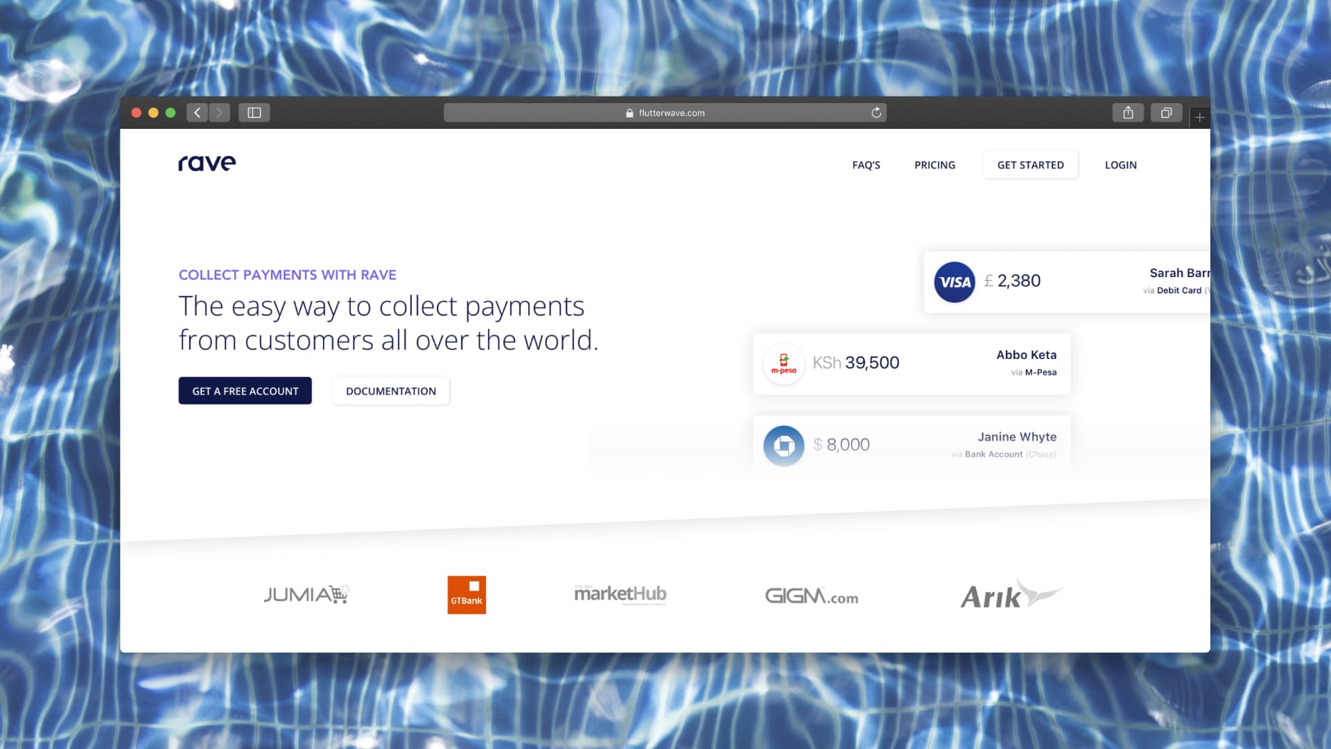
In 2017 Flutterwave had strong partnerships with banks and large corporations in Nigeria using its APIs to move local and international money. Two products carried the business: Rave, which helped businesses collect payments online across Africa, and Moneywave, which automated outbound payouts. I was hired as a contractor to redesign them, and this case study follows Rave, the product the company later rebranded to Flutterwave.com and built its brand around.
I led as Lead Product Designer with a team of four across merchant and payments. Rave had been built without much UX guidance and could not serve the segments Flutterwave needed to expand into. The remit was blunt: the funnel was broken, a fundraise was coming, and acquisition had to work.
<1%
The problem: under 1% signup
The CEO pointed me at signup on day one. The root cause turned out to be an interpretation error, not a design one. Legal wanted different documents from NGOs, large businesses and independent entrepreneurs. The product team read that as: require NGO documents, large-business documents and entrepreneur documents on the same form, and shipped it that way.
No legal entity on earth holds all three sets.
Every applicant hit a wall and concluded Flutterwave did not support their business type. Two more failures compounded it: entrepreneurs could not work out how to accept payments through the channels that actually mattered to them, and finance teams in larger corporations could not get transaction data out of Rave. Conversion sat under one percent, with a raise ahead. This was existential.
Building empathy with personas
I facilitated a proto-personas workshop with the product team, built from data the customer service and product marketing teams already held, covering the three segments Flutterwave needed to win: independent entrepreneurs, independent developers, and mid-to-large businesses.
Naming them changed the arguments. Queen, non-technical, one-woman business, on a smartphone, impatient, already using Paystack. Ted, technical, wants libraries in his language and the fastest possible implementation. Mint Inc and the Alibaba-style merchants needed transparency, sub-account structure and reconciliation their accountants could live with.
Three users, three jobs
Research ran in two passes. First, task-based usability tests on the existing product with representative users from each segment who had never used Rave, that produced a prioritised list of usability failures. Then 1:1 interviews, which surfaced problems the tests structurally could not: what people expected Rave to do, and which channels each segment actually wanted to collect payments on.
More than twenty pain points came out of it, each tagged with how many participants hit it. Couldn't view transactions for a specific period. Couldn't complete a non-technical integration. Couldn't find API keys. Couldn't get dummy cards to test with. Frequency plus revenue impact set the order of work.
- Independent entrepreneurs
- Wanted mobile money and card payments live today. Blocked by a long form, unclear payment options and documents they did not have.
- Developers
- Wanted to integrate the API without bouncing between docs and codebase. Blocked by documentation with no worked examples and no way to test a call.
- Finance teams
- Wanted transaction data out for reconciliation. Blocked by manual extraction that turned month-end into a bottleneck.
Prioritising the jobs to be done
We ran a workshop to process the research into a prioritised list of user goals, written as jobs in the user's voice, "I can easily accept bank account, USSD and POS payments from my customer", "I know where to get dummy cards for test transactions", "I can easily give my sales assistant limited access to my account".
Ranking was done on business benefit: how much Flutterwave gains if Rave successfully helps a user get that job done. The starred list became the scope of the redesign, and the goals that survived it are traceable straight into the shipped product.
- 18 votes
- 14 votes
- 11 votes
- 7 votes
- 5 votes
The top three became the scope of the initial redesign; the bottom two shipped later.
Goals and how we would know
Leadership workshops turned the research into a strategic direction and four goals: make signup user-specific, get businesses to a live payment channel fast, surface the right data at a glance for both entrepreneurs and finance teams, and make the developer path self-serve.
- Signup conversion
- From under 1% to at least 20%, the number we agreed to be judged on.
- Onboarding success
- Cut time to a user's first payment integration.
- User satisfaction
- Improve post-launch usability ratings and survey scores per segment.
Ideation and storyboarding
I ran an ideation and storyboarding workshop with the product team against the prioritised goals. The team worked in pen and paper and we came out with a solution storyboard for each goal we had committed to solving.
Those storyboards plus the information architecture we agreed in the same sessions became the brief. Under my supervision the design team built the dashboard from them, and I designed the dashboard homepage and set the design language for Rave.
20x
Signup: segment, defer, strip
The overhaul made three moves, in order of how much they unlocked.
Signup conversion went from under 1% to over 20%, verified against the original flow.
- Segment
- Ask what kind of account this is first (individual, registered business, non-profit), then show only the fields that type actually requires.
- Defer
- Remove the KYC step from signup entirely, then enforce account limits on unverified accounts until identity is confirmed. That was the compromise I reached with legal, it held their fraud exposure flat while letting a user create an account and explore the product first.
- Strip
- Cut the remaining form to what a basic account genuinely needs, and set the expectation up front, collecting payments in 48 seconds.
Original signup
- One form for every account type
- Full KYC demanded before an account existed
- No expectation set for how long it would take
Segmented signup
- Account type chosen first, fields follow from it
- KYC deferred, limits applied to unverified accounts
- Promise stated up front: collecting payments in 48 seconds
<1% → 20%+
- <1%
- 20%+
Verified against the original flow in testing.
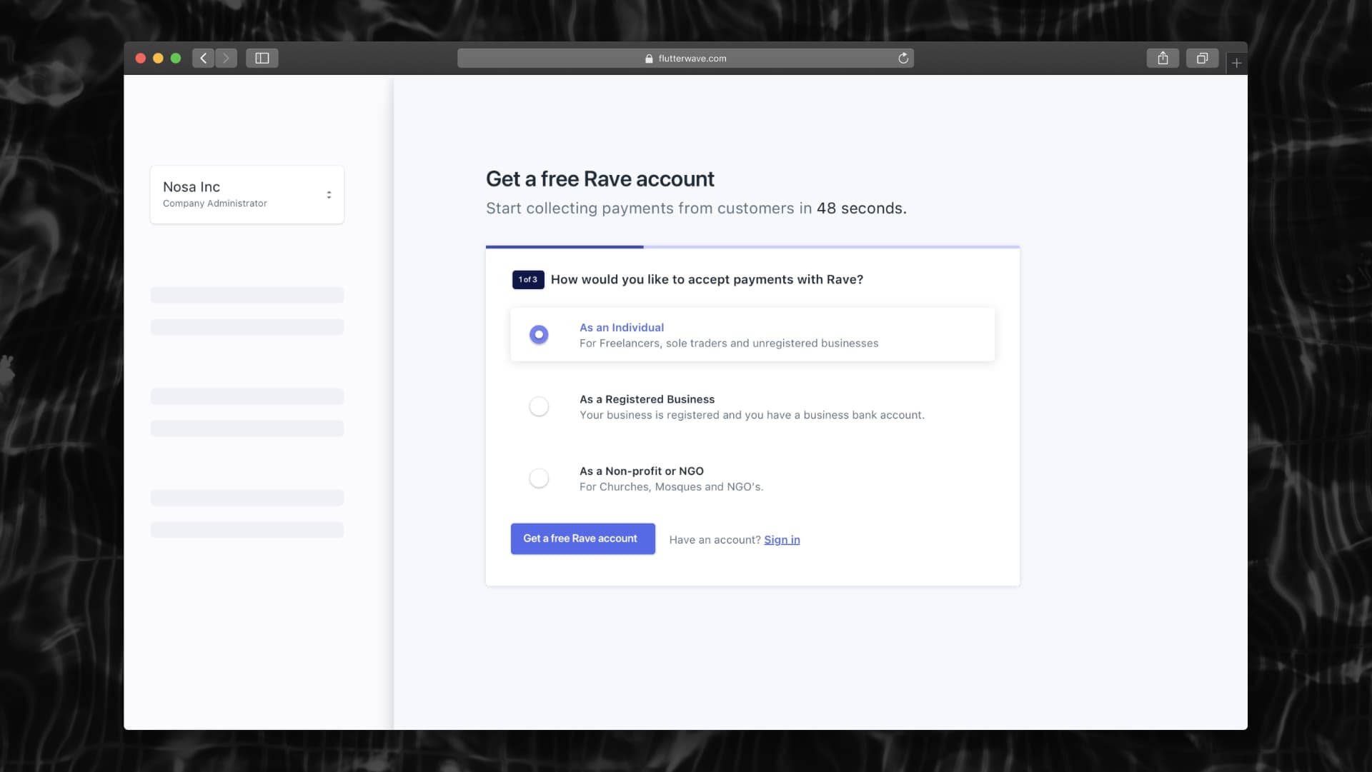
Account type comes first, so a freelancer never sees a registered-business field. KYC moves downstream.
-40%
Onboarding to first transaction
Signing up was never the goal; collecting a payment was. Previously users were left alone after account creation, developers dug through docs, entrepreneurs guessed at channel configuration. The new onboarding was personalised from what the user told us at signup.
Average time to first payment setup fell by ~40%.
- Channel-specific setup
- Users pick where they collect: social and invoices, a website pay button, in person, an e-commerce platform, or a custom integration. They then get step-by-step setup for exactly those.
- Interactive tutorials
- Developers were guided through API integration in-product, in real time, linked to rebuilt documentation.
- Progress tracking
- A visible finish line, so users always knew what remained before they could accept money.
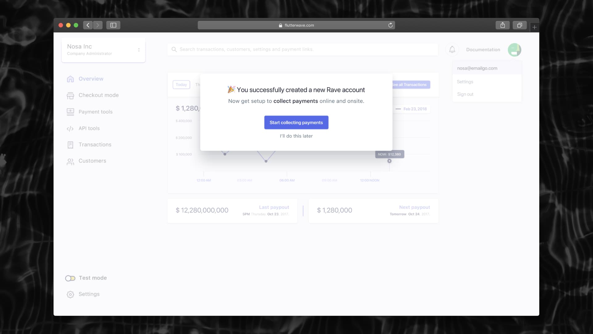
Account creation hands directly to setup rather than dropping the user on an empty dashboard.
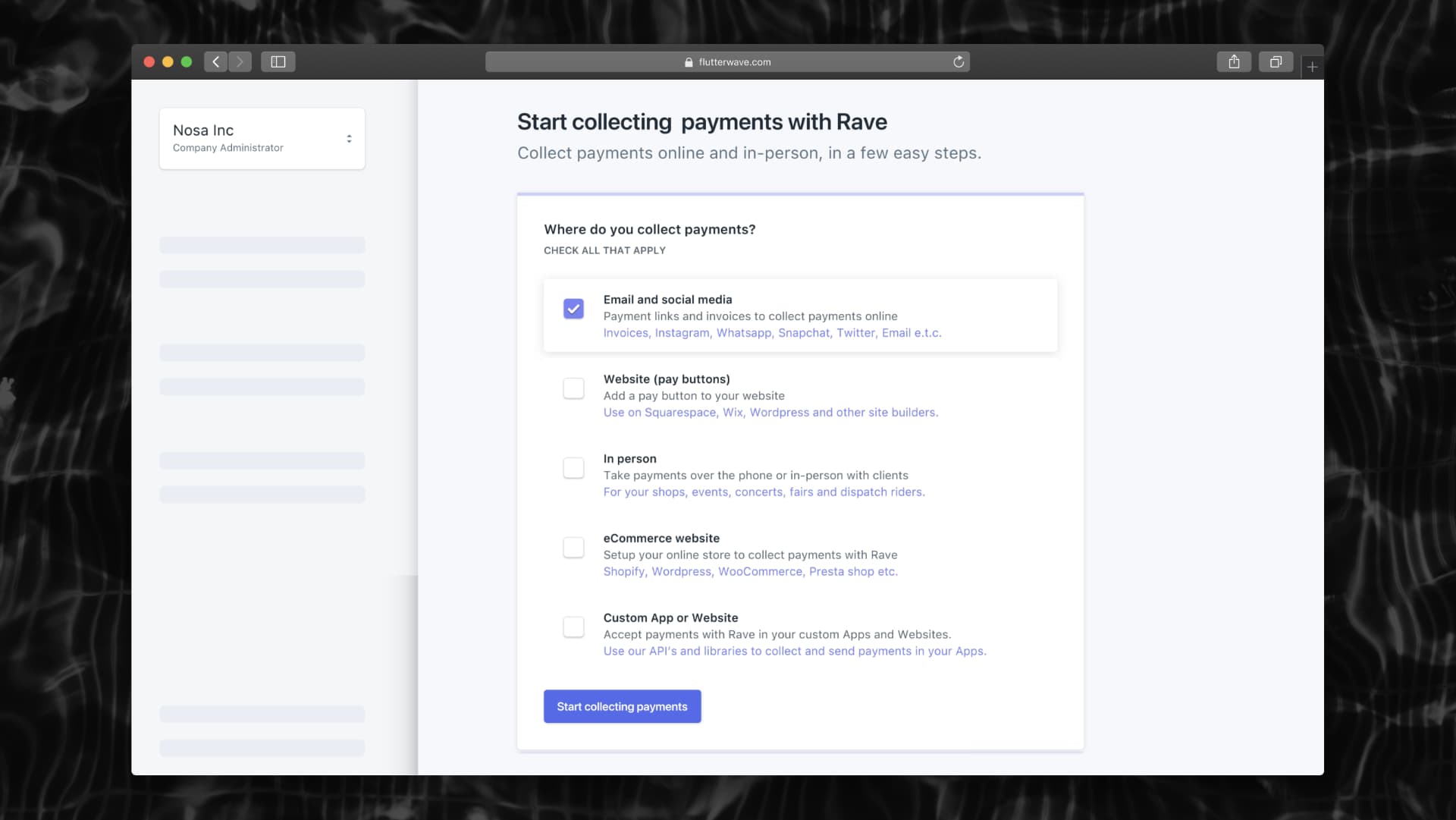
One question determines the whole setup path, replacing a generic checklist with a relevant one.
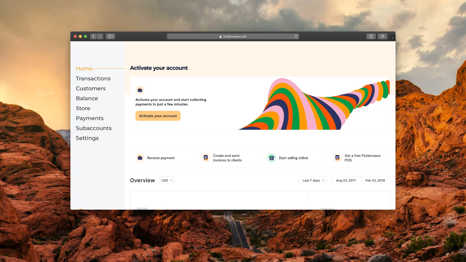
A the rebranding the Rave 2.0 Product to Flutterwave, I returned to help redesign the global onboarding post rebrand, to restore the conversion rates.
A dashboard for two very different readers
The old dashboard buried the answer. Entrepreneurs found it overwhelming; finance teams could not get data out. The redesign made the home screen answer the question each reader arrives with.
- At-a-glance metrics
- Volume, transactions, last and next payout, the numbers that decide whether anything needs attention today.
- One-click exports
- Finance teams pull transaction data straight out, collapsing reconciliation from a manual sift to a download.
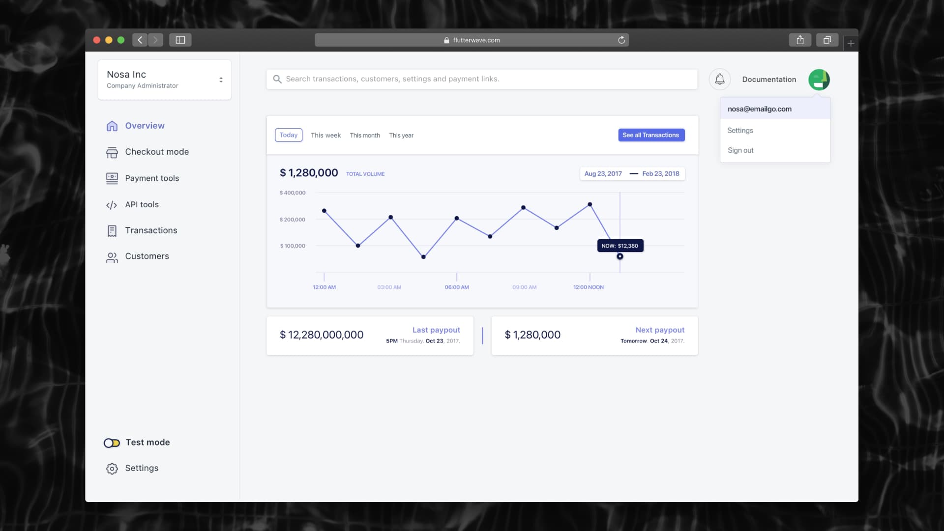
Payout timing sits next to volume, because the recurring finance-team question is when money lands, not how much moved.
Developer experience as a growth channel
Developers were the segment most able to bring volume and the one most poorly served. I led the redesign of the developer portal and API reference: real-world copy-paste code samples, step-by-step guides covering each call's parameters and responses, and a sandbox for testing calls before writing integration code.
Support tickets from developers fell and reported integration times shortened, which showed up as a rise in live API integrations rather than as a documentation metric.
curl https://api.ravepay.co/flwv3-pug/getpaidx/api/v2/hosted/pay \
  -H "Content-Type: application/json" \
  -d '{
    "PBFPubKey": "FLWPUBK_TEST-xxxxxxxxxxxx",
    "customer_email": "merchant@example.com",
    "amount": 2500,
    "currency": "NGN",
    "payment_options": "card,account,ussd",
    "txref": "rave-demo-001"
  }'

# → 200 { "status": "success", "data": { "link": "https://ravemodal…" } }Selling in person: Salesmode
Payments in these markets are not only online. I delivered Salesmode, a virtual point-of-sale that turns any browser into a terminal: enter an amount, pick card, bank account, USSD or cash, charge the customer. It extended Rave from a checkout integration into something a physical shop, event or dispatch rider could use the same day.
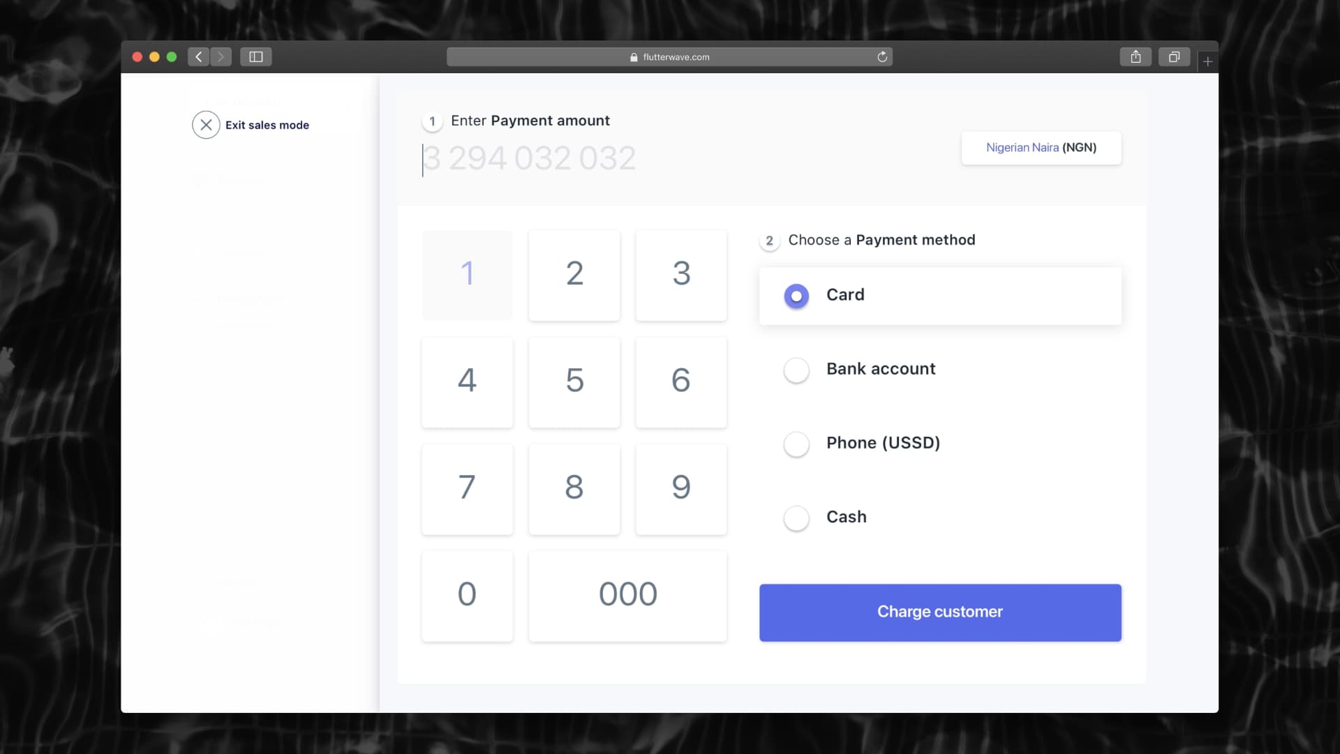
Amount then method, the sequence a cashier already uses.
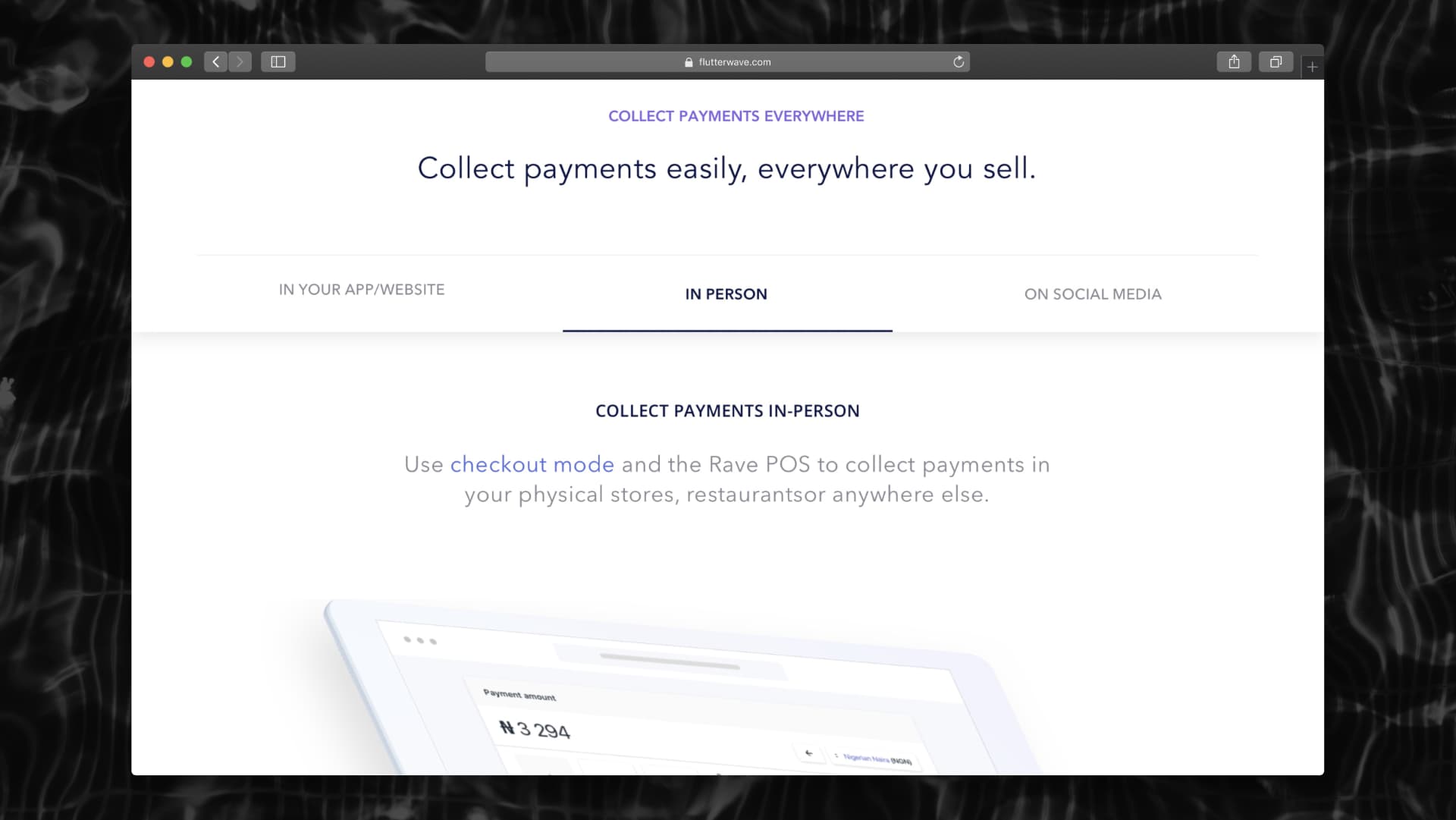
The same segmentation logic carried into positioning: users self-select their channels.
Validation
Task-based usability testing measured how users actually moved through the existing product and confirmed the interview findings, most entrepreneurs abandoned signup around halfway, at the point the form demanded documents.
The redesigned signup and onboarding were then tested against the originals and tracked in analytics. Conversion rose 20x, more users completed setup, and they did it faster.
After Rave: Moneywave
Rave solved half the problem. African businesses could now collect money; sending it out (supplier payouts, payroll, cross-border transfers) still meant bank portals and spreadsheets. Immediately after Rave 2.0 I was asked to run the same process on Moneywave, the sister payouts product. Later merged into what is now Flutterwave.
The method carried over: segment first, then design. A solo merchant paying two freelancers and a finance team pushing a thousand-row payroll file are the same job at different scale, so the product had to hold both without forking into two apps.
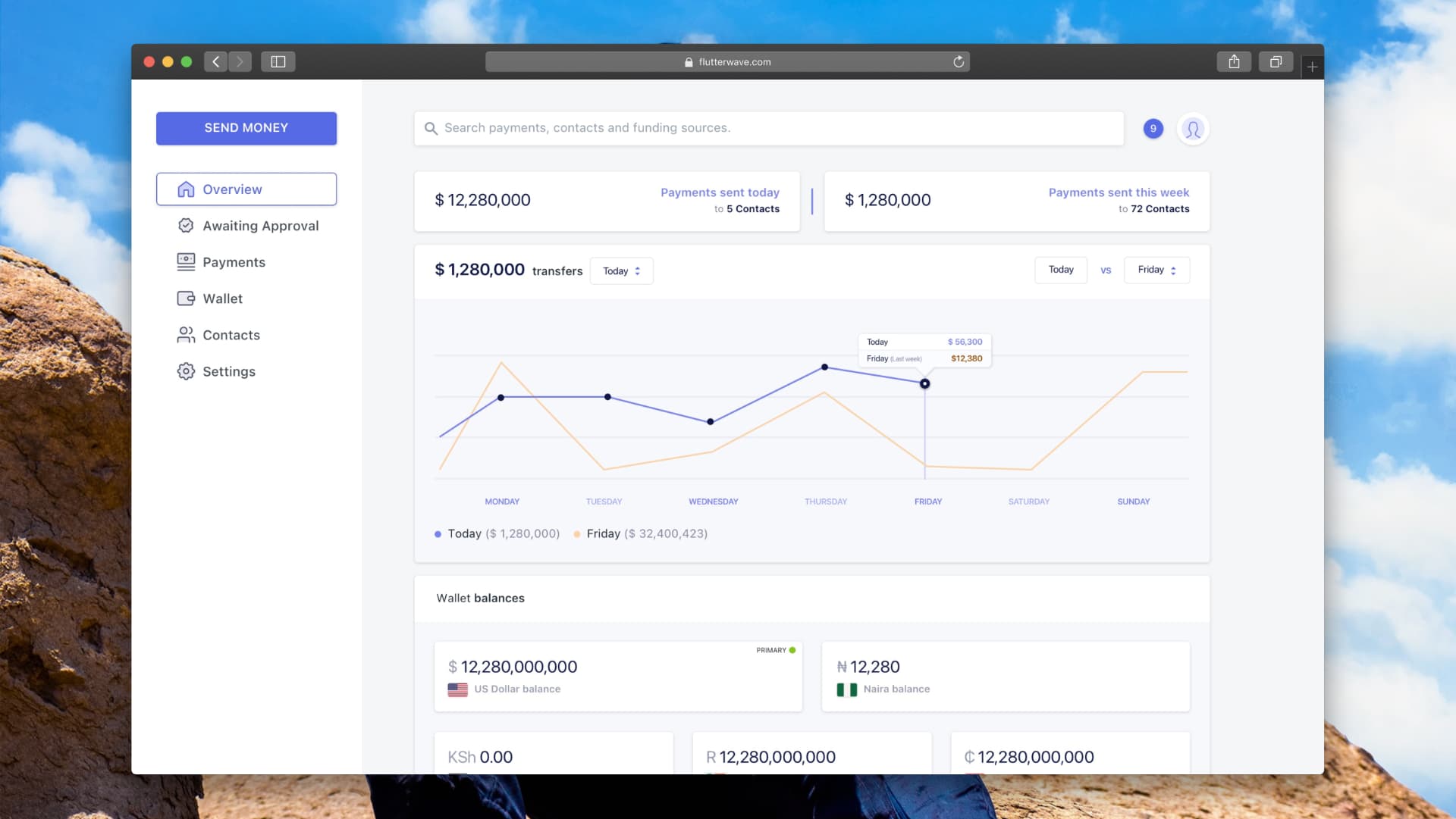
The overview answers the payer's two standing questions, what went out, and what is left to pay with, before any navigation.
One form, three ways to send
One-time payment, recurring transfer and bulk upload were originally three separate journeys. I collapsed them into a single form with a mode switch at the top, so the fields a payer already knows (amount, reference, recipient) stay in the same place regardless of how often the payment repeats.
- Funding source, priced honestly
- Choosing a card surfaces the five-day settlement inline, with wallet and bank offered as the instant alternative, the trade-off is stated where the choice is made, not discovered after sending.
- New or saved recipient
- Recipient details expand in place rather than sending the user to a contacts screen and back.
- Scheduling without a detour
- Scheduling is a modal over the same form, pre-filled with what was just entered, so a future-dated payment costs one extra decision instead of a second flow.
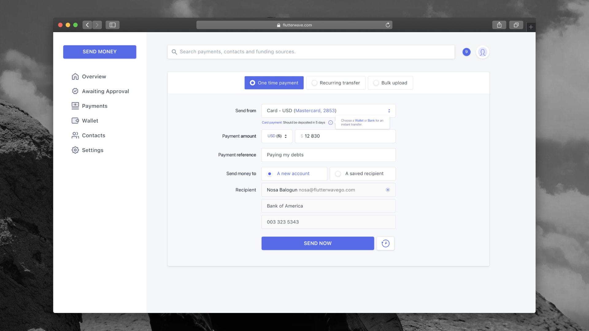
Mode switch on top, identical fields underneath — the form teaches itself once.
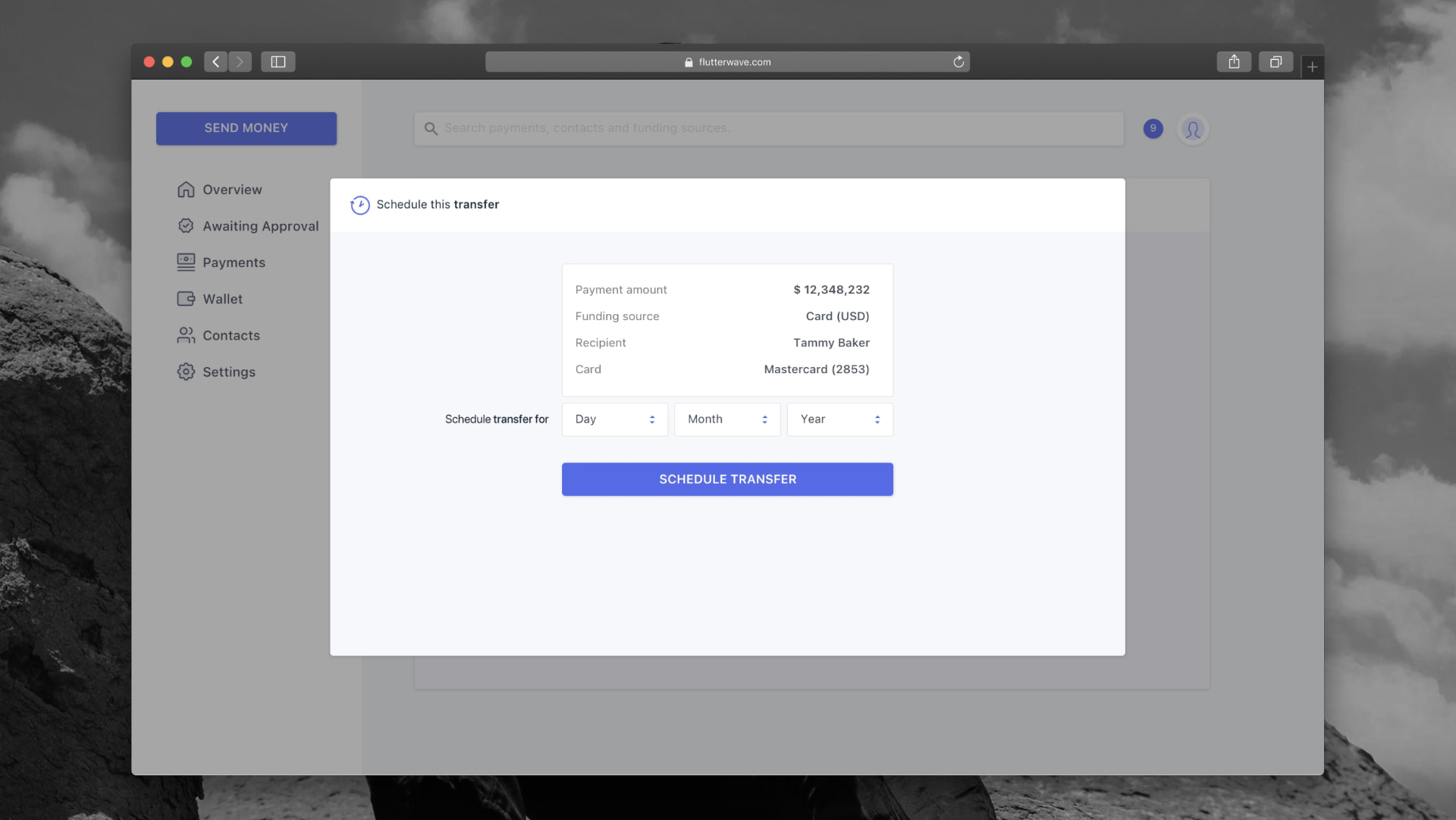
The schedule modal restates the whole payment with a clear overview.
Money in one place
Cross-border payouts fail on funding, not on intent. Wallets in USD, Naira, Rand, Cedi and Shilling sit on one surface alongside saved cards and bank accounts, so a payer can see whether a transfer will clear before starting it.
First-time users hit a persistent banner instead of an empty state: adding a card or bank is a two-step modal that asks only for country, bank and account number before verification.
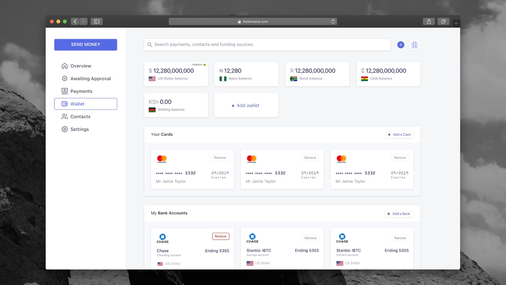
Balances, cards and banks on one screen — the funding question answered in a glance.
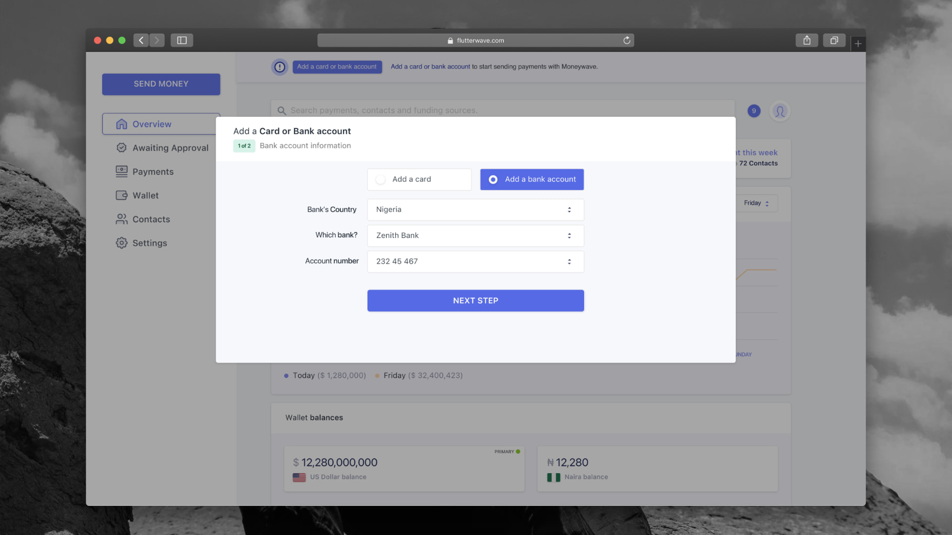
Three fields to unblock a first payout, launched from the banner that flags the gap.
Built for two people, not one
In the businesses we interviewed, the person who initiates a payment is rarely the person who approves it. The transfers list is therefore built around accountability: every row carries status, amount, destination bank and who sent it, with an Awaiting Approval queue as its own destination in the nav.
- Status that distinguishes failure from refusal
- Completed, failed and rejected are separate states, a declined bank transfer and a colleague's rejection need different next actions.
- Detail on demand
- A row expands into full transaction and recipient information, so reconciliation happens in the list instead of in an export.
- Filters as chips
- Sender, source wallet and status persist as removable chips, which keeps a finance team's working view visible and customisable.
- Notifications per person
- Each team member chooses which transfer events reach them (scheduled, cancelled, sent), so approvers are not buried in the same alerts as initiators.
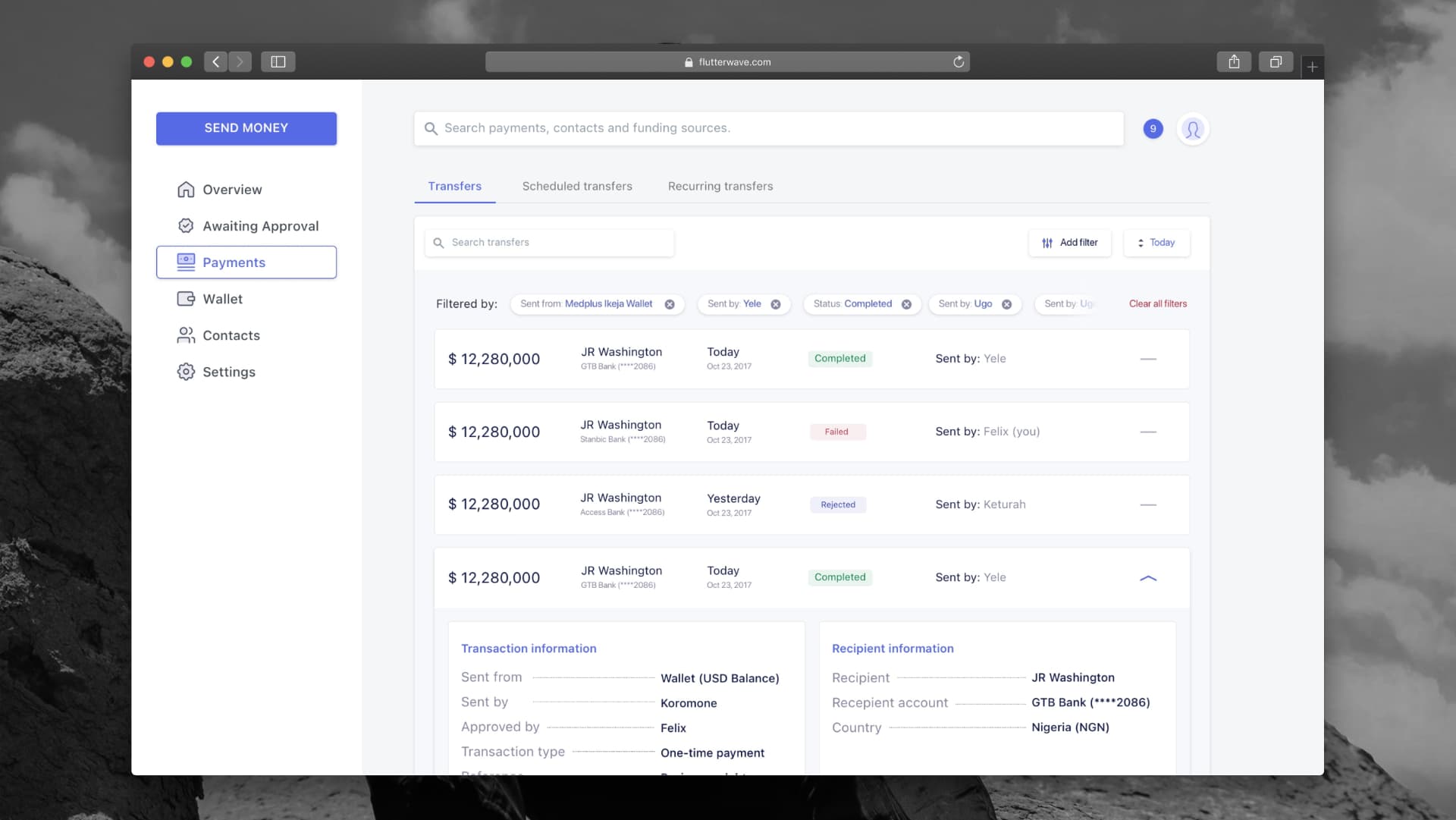
One row expanded gives the full audit trail without leaving the queue.
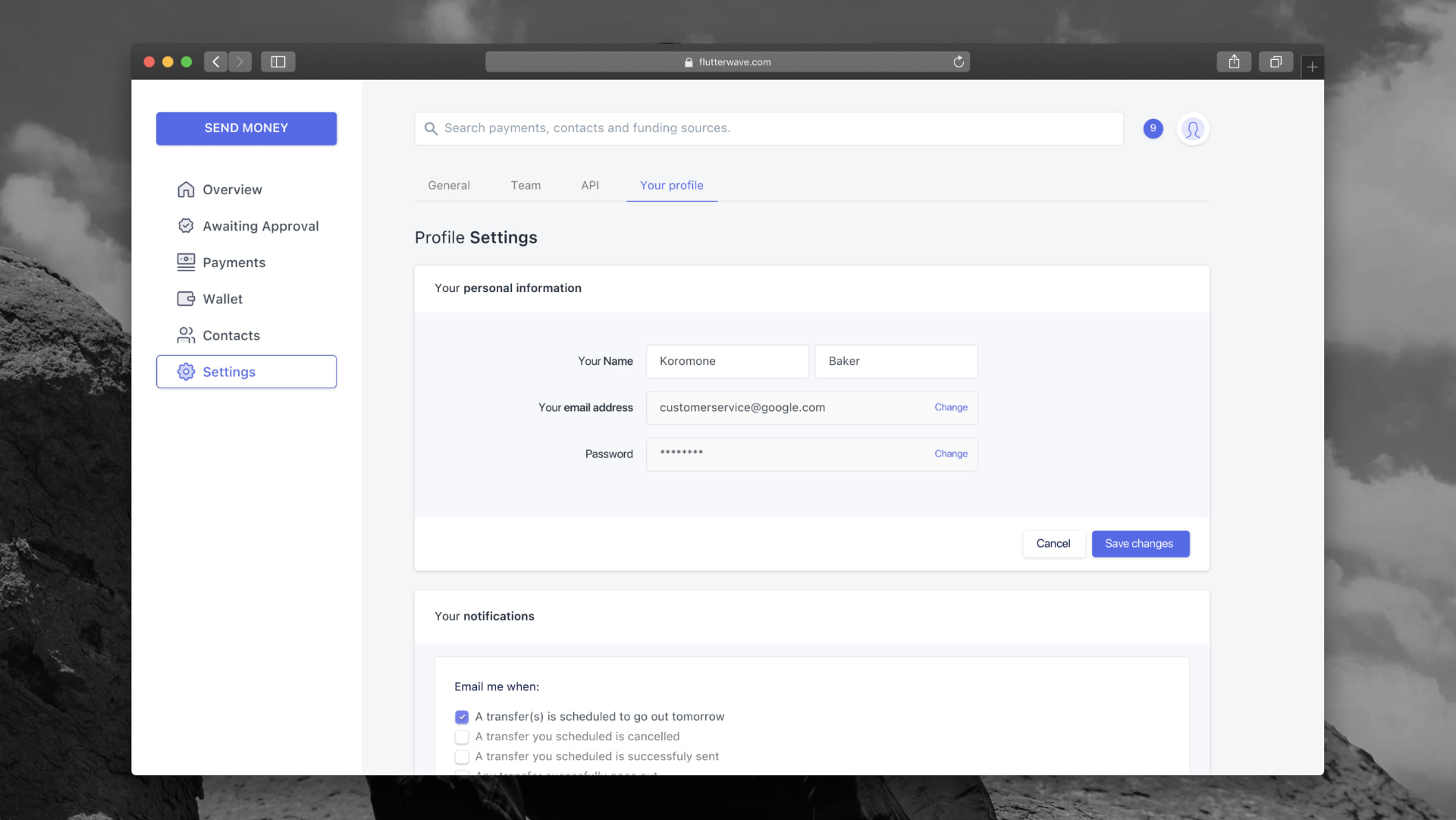
Notification preferences are scoped to the individual, not the account.
Same method, other direction
Moneywave was Rave's method applied to payouts: resolve the users into distinct jobs, sequence what each one has to prove, and remove the steps that exist for the platform rather than the payer. The same pain-point exercise ran again, and it produced a different top of the list, sending to many people at once, scheduling ahead, and getting a transfer approved.
Collection and payout later merged into the single product.
Results
Outcomes
- Signup conversion up 20x, from under 1% to over 20%, verified by testing against the original flow
- Time to first payment setup down 40%, with more users completing onboarding
- Every user flow identified as critical to revenue and growth was unblocked, letting Flutterwave go to market and hit its growth targets
- One year after the redesign the company bet its brand on the product: Rave was rebranded to Flutterwave and became the core focus
- Rave became Flutterwave's flagship product, the platform behind the company's $1B+ valuation
Reflection
Learnings
- Segmentation beats simplification, the same form cannot serve a freelancer and an enterprise
- Compliance is negotiable in sequence, not in substance: deferred KYC unlocked the funnel without weakening it
- Developer experience is a growth channel, not documentation hygiene
- Prioritising pain points by frequency and revenue impact made the roadmap an argument rather than a wishlist